…And then came London. Fresh new talent is released to us in perhaps the most effective way it can be; with the CSM catwalk. Luke Brooks particularly caught my eye with his crazy questioning head pieces, and platform fringed shoes (I want a pair!). His collection was very varied in pieces but yet they all seemed to fit together perfectly. Debatably his show stopping piece was his tribute to the Olympics, the bright print eye-catching and beautiful, somehow expressing the stylish and sophisticated side of the sporting event along with its historical and contextual background, taking the term sportswear to a new level.

Brooks has managed to successfully use unusual combinations of materials to produce intriguing individual items. It commendable that he has managed to think of designs completely out of the box even today when the fashion world is so diverse.

Here he has managed to add originality to the netted/ crocheted beach dress with a panel reminiscent to an advertising pamphlet or large label promoting his name, when described the genius cannot fully be understood, but the positioning of the panel and the trendy simplicity of it makes it ideal for beach holidays abroad.

Nobody will be surprised that I was bubbling with excitement both in anticipation of the show then in admiration after actually seeing the garments for Mary Katrantzou’s autumn/winter 2012 ready to wear. Patter, pattern, pattern everywhere…I am in awe as how this lady can produces such vibrant, different and what would usually be considered as busy pieces, in such a way that they wearable and aesthetically pleasing.

One of her most quirky focuses this time was that of stationary; large pencils cover the dress in a series of patterns, as they do with several of her pieces, yet all are completely different….. and what is most astounding is that at first the fact that they are pencils is not always obvious!
It is not just the dresses that are of particular interest in Mary Katrantzou’s collection this time; her trouser suits, and two piece sets received just as much attention for their beautiful quirky designs.

Even the shapes of the dresses were different and exceptionally interesting. My particular favourite was that of the dress below; with its feminine combination of almost two types of skirt combined.

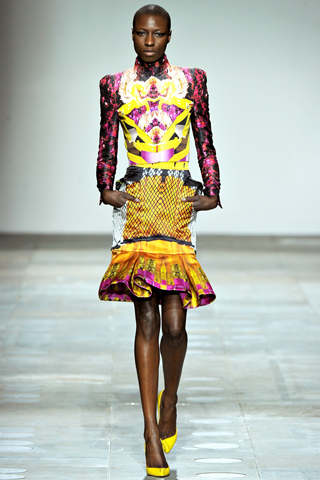
Another garment which makes you look again is the one below with what appears to be a cage of netting surrounding the base skirt.
There was one model however that I thought was perhaps a little too eye-popping once all the items of clothing were worn together. Each separate garment has a beautifully considered colour pallet and the pattern which is throughout, but ranging in size for each piece is as lovely as the rest , however together I regret to say they are perhaps a little too busy in my opinion and hurt my eyes.

That is to say this is only one outfit of the whole entire collection and only my opinion. The rest of the show was superb with the star garments of the show being the more subtly coloured and patterned dresses with a prominent original shaping. With a the top print reminiscent of the sky and the dominantly pastel colour pallet there is an almost angelic quality which supports the floaty skirt. The fitting of the top to be like that of a structured shirt however adds that powerful edge.

I could not not mention Jonathan Suanders when London fashion week is the subject. He , also known for his beautifully fresh prints did not disappoint. The panelled dresses covered with different unnatural hues of water lilies each looked completely different and gave off an individual mood. The tangerine shades where perhaps my favourite, contrasting elegantly with the white shades on the dress and portraying the vibrant colour of the autumnal season. The belts on the dresses also emphasise the delicate shape the woman.

Another dress of his which was shaped beautifully was that of the V-necked green number. I think the material, colouring and pattern here will conduct extremely different responses, but to me it looks gorgeous.

Another of his shows garments which has stuck persistently in my mind is the one below. Again the basic dull colouring of the black against the vibrancy of the red creates an eye-catching effect. I particularly like how the black line continues across her arms after the models waist. Almost like she has been sprayed with a line of graffiti, but in a way which oozes sophistication. The black belt boldens the colour. The section is extremely interesting as it almost looks like that part of the body is missing. I can imagine this would make the size of the waist of a non-model sized woman appear smaller.

Another Designer which was brought to my attention for the first time this season was Peter Pilotto. Although many have complained that some of his show was extremely similar to previous ones after research I think he was only promoting what his label does best and I think he has introduced some new pieces which add a new optimism of style to his collection. His use of striped fur is what is particularly memorable for me about this collection. He has almost promoted the craze of fur and native trends of the last few seasons in a new light which I think is very appealing and clever. The fur compliments the rest of the garment; not overpowering the outfit in a negative light whatsoever.

His primary colour pallet consisted of lime greens, various shades of blue and black which together produced a futuristically beautiful theme. The shaping of the garments maintains futuristic connotations and also that to see life.

I could go on forever about London fashion week as it is one of my favourite times of the year (, as I could about the designers and garments above!), but you’re best to see it for yourself. The images I have used are from http://www.style.com/ who has easily accessible coverage of the majority of the shows that have occurred.


 I combined their designs and personalities with the most fitting trends; looking at American car inspirations and pale pastel colours on top for the lovely lady above, the tribal style for the great girl who is below and looking at the large lettering, playful embellishments for the great girl, below right.
